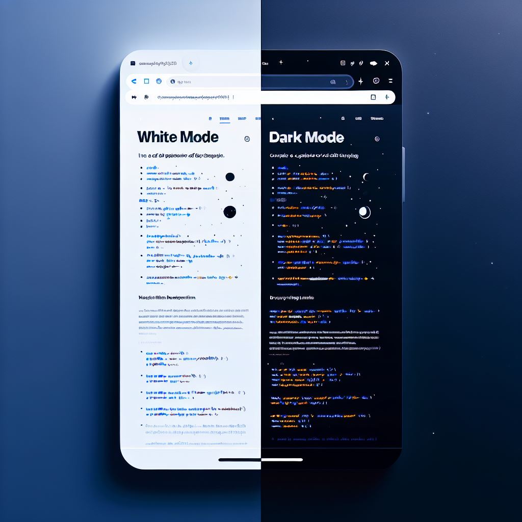
Dark Mode in a couple of CSS Lines. https://codewithdrzeeshanbhatti.com/
Implementing dark mode on your website can be incredibly simple with just a few lines of CSS. Here’s a breakdown of the code you provided and how it works:
root {
–bg-color: white;
–text-color: black;
}
@media (prefers-color-scheme: dark) {
:root {
–bg-color: black;
–text-color: white;
}
}
body {
background-color: var(–bg-color);
color: var(–text-color);
}
Explanation:
- CSS Variables:
- The
:rootselector targets the highest level of the document tree, which is the<html>element. - Inside
:root, we define two CSS variables:--bg-colorand--text-color. Initially, these are set towhiteandblack, respectively.
- The
- Media Query for Dark Mode:
- The
@media (prefers-color-scheme: dark)query checks if the user has set their system to dark mode. - If dark mode is preferred, the variables
--bg-colorand--text-colorare redefined toblackandwhite, respectively.
- The
- Applying the Variables:
- In the
bodyselector, we use thevar()function to apply the CSS variables.background-coloris set tovar(--bg-color)andcoloris set tovar(--text-color). - This means that the background and text colors of the body will change based on the user’s preferred color scheme.
- In the
How It Works:
- When the page loads, the initial values of
--bg-colorand--text-colorare applied, setting the background to white and the text to black. - If the user has dark mode enabled on their device, the media query will trigger, and the values of
--bg-colorand--text-colorwill switch to black and white, respectively. - This dynamic change ensures that your website adapts to the user’s system preferences without needing any JavaScript.
This approach is efficient and leverages modern CSS features to provide a better user experience. Happy coding! 😊
Is there anything else you’d like to know about CSS or web development?


